Why Do Beautiful House Plans Fail in Real Life?
I want you to imagine something.
You are holding a set of house plans. The paper is crisp, the lines are sharp, and the 3D renderings attached to them look like something out of a luxury magazine. The living room flows into the dining area, the master bedroom has a panoramic view, and the facade is a stunning mix of glass and stone. It feels perfect. It feels like the home you’ve been dreaming of.
Now, I want you to imagine me.
I am standing on a muddy construction site in the middle of winter, wearing a hard hat and looking at a concrete foundation that has just been poured. I am holding those same plans, but they are covered in dust and coffee stains. I am looking at the structural columns, and I am realizing that the stunning "open concept" living room the architect drew is going to require a steel beam so massive it will cut through the ceiling and ruin the entire effect. Or I’m realizing that the "panoramic view" faces directly west, meaning that room will turn into an oven every single afternoon.
I have spent twenty years in construction. I have worked as a site engineer, a project manager, and a consultant. I have overseen the building of everything from small cottages to large complexes. And in that time, I have seen the exact same pattern repeat itself over and over again: People fall in love with a beautiful drawing, spend a fortune building it, and move in only to find that the house is actually a nightmare to live in.
It happens all the time. And it breaks my heart to see people lose their life savings on a mistake that could have been avoided if they had just understood the difference between "paper beauty" and "living reality." This article is not going to sell you anything. I am writing this because I am tired of seeing good people get hurt by bad designs. I want to explain to you, in plain English, why beautiful plans fail in the real world, and what you need to watch out for before you pour a single drop of concrete.
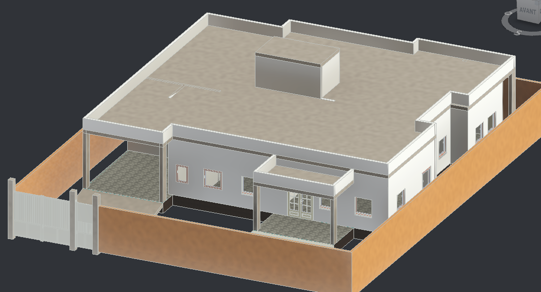
The Illusion of the Paper World
The first and biggest problem is that drawings lie to you. They don’t mean to, but they do. When you look at a floor plan on a screen or a piece of paper, you are looking at a 2D world. Your brain fills in the gaps. You see a rectangle labeled "Master Bedroom – 16’ x 14’" and you think, "That sounds big." You see a wide line representing a wall, and you think, "That’s just a line."
But in reality, that line is eight inches of concrete or brick. That bedroom isn’t just a flat space; it’s a volume with doors that swing open, wardrobes that need depth, and air conditioning units that protrude from the walls.
On paper, everything is quiet. There are no noises, no smells, and no people. On paper, you don’t have to walk from the kitchen to the dining room carrying a hot pot of soup while trying to dodge a dining chair. On paper, you don’t have to worry about the sun glaring off the TV screen.
I’ve seen so many plans that look like art. They are balanced, symmetrical, and pleasing to the eye. But architecture is not art; it is the background for your life. If the house looks good but functions badly, it is a failure. A beautiful car that doesn’t start is useless. A beautiful house that you can’t live in is a burden.
Visual Beauty vs. Functional Comfort
This is the hardest truth for many people to accept: Visual beauty often fights against functional comfort.
In the world of design, there is a constant pressure to make things look "clean" and "minimal." Architects often dislike seeing doors because they "clutter" the drawing. So, they hide them or reduce the number of passages. I’ve seen beautiful plans where the only way to get from the living room to the kitchen is to walk through a narrow "slot" tucked behind a wall, or where the bathroom door opens directly into the kitchen area.
Why? Because on paper, having too many doors looks "messy." But on a real site, in a real family, this is chaos.
I remember a project we built for a young couple. The plan was gorgeous. The kitchen was an open-plan showpiece. But the designer placed the refrigerator in a niche that was technically part of the hallway, separate from the kitchen counters, to keep the "kitchen lines" straight. On the renderings, it looked sleek.
In reality, every time someone wanted a drink of water, they had to walk out of the kitchen, around a corner, and open a fridge in the hallway. It broke the flow of the kitchen completely. The wife told me later, "I hate this fridge. I feel like I’m living in a hotel corridor."
That is the difference between a designer and a builder. A designer thinks about how the lines look on the page. I think about how you move when you are tired, carrying groceries, or holding a baby.
The Ghost of Bad Circulation
If there is one thing that kills a house faster than anything else, it is bad circulation. And it is almost invisible on paper. Circulation is the path you take to move through the house. It is the "hallway" logic, even if there is no hallway.
I’ve seen beautiful plans that create "dead zones" or "ghost corridors." Imagine a plan where the living room, the guest room, and the kitchen are all arranged in a long line. To get from the living room to the kitchen, you have to walk past the door of the guest room. To get from the kitchen to the dining area, you have to cut through a corner of the living room.
On the drawing, it looks spacious because the dimensions of the rooms are large. But in real life, you feel like you are constantly intruding. You can’t sit in the living room to watch a movie without people walking through your space to get to the fridge. You can’t sit in the dining room without people cutting past you to go to the balcony.
Long corridors are another trap. Builders hate long, narrow corridors that don’t lead anywhere or that serve just one room. They are expensive to build—you have to light them, ventilate them, and floor them—and they take away space from the rooms. But architects love them because they create "drama" or "separation."
I have stood on site with many foremen, looking at a long, dark corridor that leads to a single bathroom, and heard them say: "This is wasted space. We are building a tunnel, not a home."
Good circulation is invisible. You move through the house without thinking. Bad circulation is like a pebble in your shoe—it irritates you every single day, but you can’t always point to exactly what’s wrong.
The Lie of Room Sizes
This is where the math gets people into trouble. A room listed on paper as 12 feet by 12 feet sounds adequate. 144 square feet. That’s enough for a bed, right?
Then we start building. We put in the exterior walls; that’s 8 inches gone on two sides. We put in the drywall or plaster on the inside; that’s another few inches. We install the door casing. The door swings into the room, and that arc eats up about 10 to 12 square feet of floor space that you cannot put furniture on. We add the wardrobe.
Suddenly, your 12x12 room has a clear space for a bed that is barely 9 feet wide. If you have a queen-size bed, which is 5 feet wide, you have exactly 2 feet on each side. That is not enough room to walk comfortably.
I’ve seen bedrooms in luxury homes where, once the furniture was moved in, you had to shuffle sideways to get from the door to the bed. I’ve seen "spacious" living rooms where the sofa had to be pulled away from the wall because the door swung into the space where the sofa was supposed to go.
"Doors are the enemy of space. On paper, a door is just a swing. In reality, it is a moving wall that eats your furniture."
When you look at a plan, don't look at the total dimensions. Look at the clear space. Subtract the walls, subtract the door swings, subtract the wardrobe depths. What is left is the reality.
Ignoring the Climate: The "Copy-Paste" Disaster
This is perhaps the most frustrating issue I see. We live in an era of the internet where you can find a beautiful house plan from California, Dubai, or Scandinavia and download it instantly.
People see a stunning glass box in Norway and think, "I want that in my tropical climate." Or they see a Mediterranean villa and try to build it in a cold, rainy region. This is a recipe for disaster.
I worked on a house where the owner copied a plan from a hot, dry climate. The design had massive, floor-to-ceiling glass windows facing west to catch the sunset. It looked breathtaking in the photos. But we were building in a region with hot, humid summers and torrential rains.
When the house was finished, the afternoon sun hit that glass for four hours a day. The heat gain was incredible. The air conditioning worked 24 hours a day and still couldn't cool the room. The electricity bills were astronomical. And when it rained, the wind drove water right into the sliding tracks because the overhangs were too shallow.
The owner came to me after the first summer, sweating and angry. "Why isn't this house comfortable?" he asked.
I had to tell him the hard truth: "The house was designed for a different planet, not for this plot of land."
Buildings need to breathe. They need to respect the sun, the wind, and the rain. In hot climates, you need deep overhangs to shade the glass. In cold climates, you need compact forms to reduce heat loss. In noisy areas, you need windows that don't face the street, no matter how pretty the view is. When you ignore the environment, nature fights back. And nature always wins.
The "Recycled" Plan Problem
Why do so many plans ignore the climate and the site? Because most plans you see online are recycled, cloned, or copy-pasted. Architects and designers are often under pressure to produce volume. They have a "library" of plans that worked before. They pull one out, tweak the facade a little bit, and sell it to you as a "custom design."
But there is no such thing as a "universal" site. Every plot of land is different. The slope might be different. The soil might be rocky or clay. The way the wind hits that specific hill is unique.
When you use a recycled plan, you are forcing a square peg into a round hole. I have seen plans where the garage is placed on the high side of a sloping plot, requiring us to build a massive, expensive retaining wall just to hold up the driveway. If we had simply flipped the plan, mirroring it, the garage would have sat on the flat ground. But the designer didn't check the site topography.
I’ve heard engineers say: "Who designed this? Did they ever visit the land? We are going to have to spend fifty thousand dollars just on excavation to fix this drawing."
No Construction Logic: The Builder’s Nightmare
Let let me tell you about the war between the architect and the builder. Architects draw lines; we have to build them.
Sometimes, an architect draws a roof line that looks like a bird’s wing. It is beautiful. But then the structural engineer looks at it. To make that roof stand up against snow and wind, we need a complex network of steel beams. These beams are deep. They have to go somewhere.
Suddenly, the "vaulted ceiling" in the master bedroom is gone, replaced by a massive beam running right down the middle. Or, to hide the beam, we have to drop the entire ceiling height, making the room feel like a cave. This is a lack of construction logic.
I see plans with columns placed in the middle of open spaces to support a heavy roof. On paper, the column is a small square. In reality, it is a concrete pillar right where you wanted to put your dining table. I see plans where the bathroom plumbing wall is on the opposite side of the house from the kitchen, meaning we have to run pipes for hundreds of feet under the slab. This costs more, leaks are harder to fix, and the water pressure drops.
Just last month, I was reviewing a plan. The wall of the living room was all glass. But right behind that glass wall, the designer had placed a staircase. The structural engineer looked at me and said: "This looks nice, but it won’t work on site. We can’t get the roof trusses in. We’ll have to build the whole house in pieces, which will double the cost."
The Silence of the Experts
Builders often see these problems coming a mile away, but they don’t always speak up until it’s too late. Why? Because the client is in love with the drawing. If the builder says, "This layout is bad," the client thinks the builder is just being difficult.
I have sat in many meetings where the engineer looks at a plan and shakes his head. Here are some real things I have heard professionals say on site:
- "We’re going to have problems building this. The reinforcement doesn’t line up with the architecture."
- "This plan was not designed for reality. There is no space for the AC ducts. We’re going to have to box them in and the hallway will be narrow."
- "It’s a pretty picture, but it’s a headache. We’ll have to break four walls just to get the materials inside for the next phase."
These are not complaints. These are warnings. They are the voice of experience trying to tell you that the reality is harder than the paper.
How to Protect Yourself
So, how do you avoid the trap of the beautiful plan?
Think in 3D
Don't just look at the floor plan. Close your eyes and imagine walking through it. Imagine carrying a laundry basket. Imagine coming home in the dark. Where do you bump into walls? Where do you trip?
Demand a "Builder’s Review"
Before you approve a plan, take it to a general contractor or a structural engineer—not the designer. Ask them: "Is this easy to build? Where will the hidden costs be? Are there any structural issues?"
Check the Climate
Look at where the sun rises and sets on your specific plot. Make sure the windows capture the light, not the heat. Ensure the roof suits the rain or snow you get.
Measure Your Life
Don't look at room sizes. Measure your actual furniture. If you have a king-size bed, draw it on the plan. Draw the door swing. See what space is left.
Trust the "Ugly" Truth
If a builder tells you a beam will be in the way, listen. It might ruin the look on paper, but it will save your living room in real life.
The Final Truth
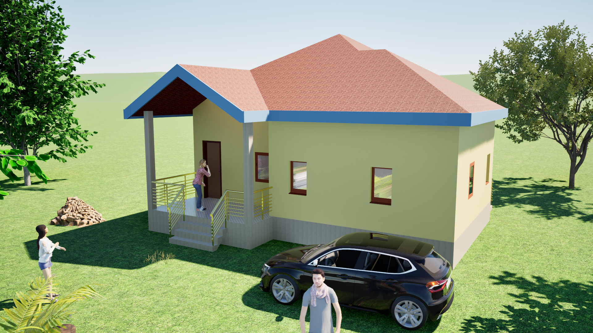
Beauty is not the enemy. I love beautiful buildings. A well-designed house that is both functional and beautiful can lift your spirit every time you pull into the driveway.
But beauty without function is dangerous. Beauty without logic is expensive. A house plan is not just a piece of art; it is a machine for living. It has to work. It has to keep you dry, it has to keep you warm, and it has to move with you, not against you.
Do not be seduced by the glossy renderings. Do not be impressed by the fancy fonts and the 3D trees. Look at the lines. Ask the hard questions. Respect the site and the climate. Because when the construction crew leaves and the dust settles, you are the one who has to live there.
Build something that works. Then, and only then, will it truly be beautiful.